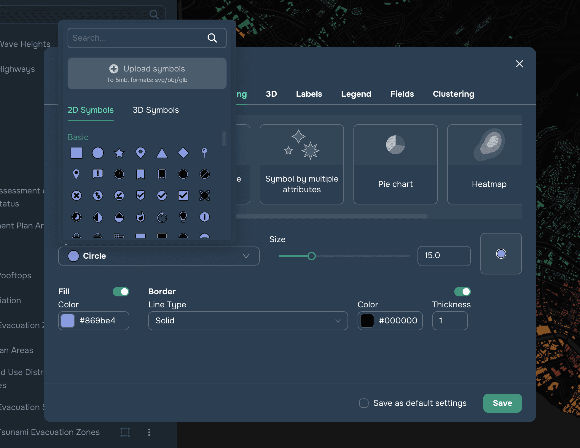
Este estilo es aplicable a todos los elementos espaciales y se refiere a una única visualización para todos los objetos de la capa. Es posible personalizar el símbolo, el tamaño, el relleno y el borde (véase la Figura 1).

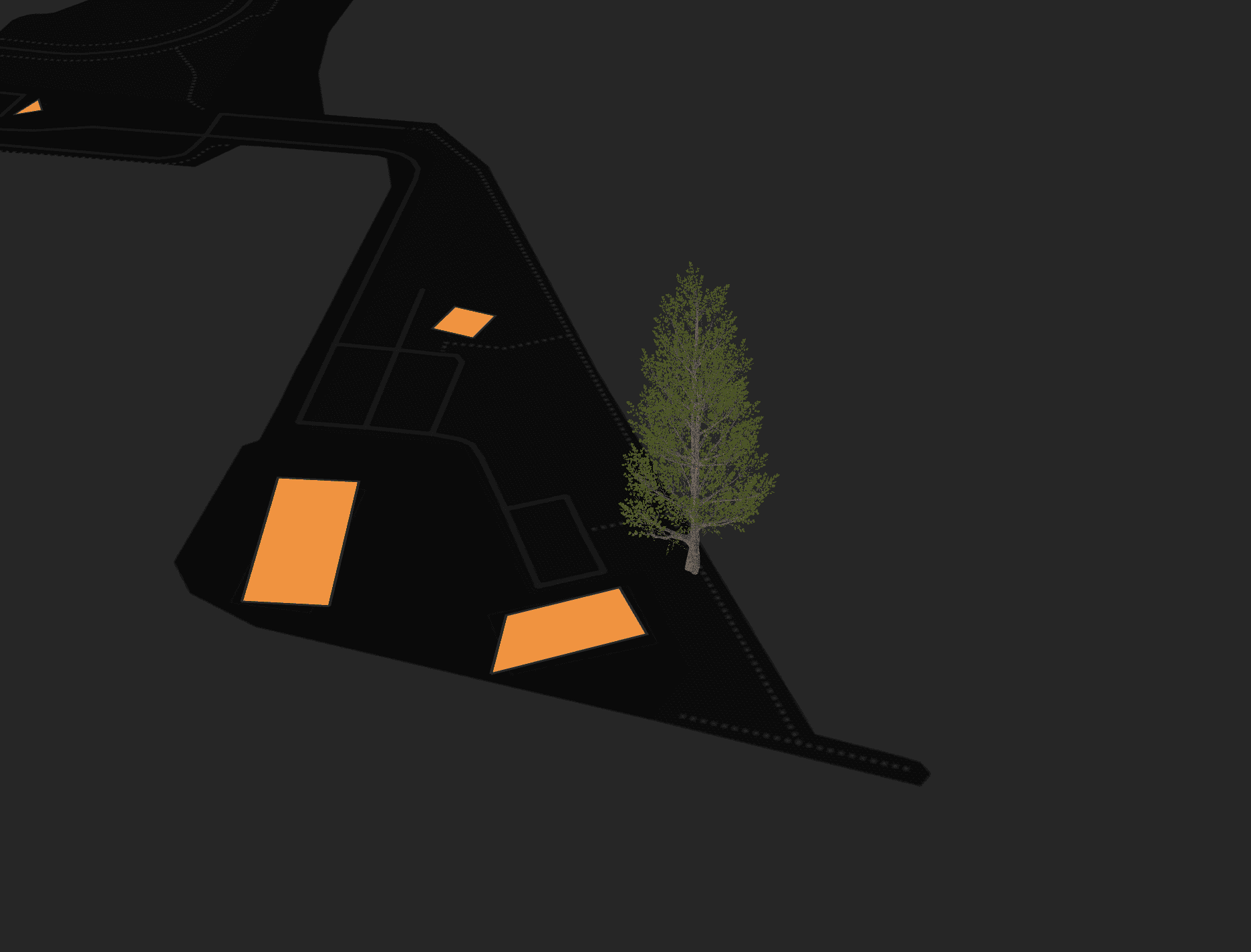
Puede personalizar el símbolo (para objetos puntuales) y también puede cargar su propio símbolo en formatos svg, obj y glb de hasta 5 MB de tamaño (véase la Figura 2). Los modelos obj y glb solo pueden aplicarse a capas añadidas como vectores y mostradas en modo de vista de mapa 3D (véanse las Figuras 3).
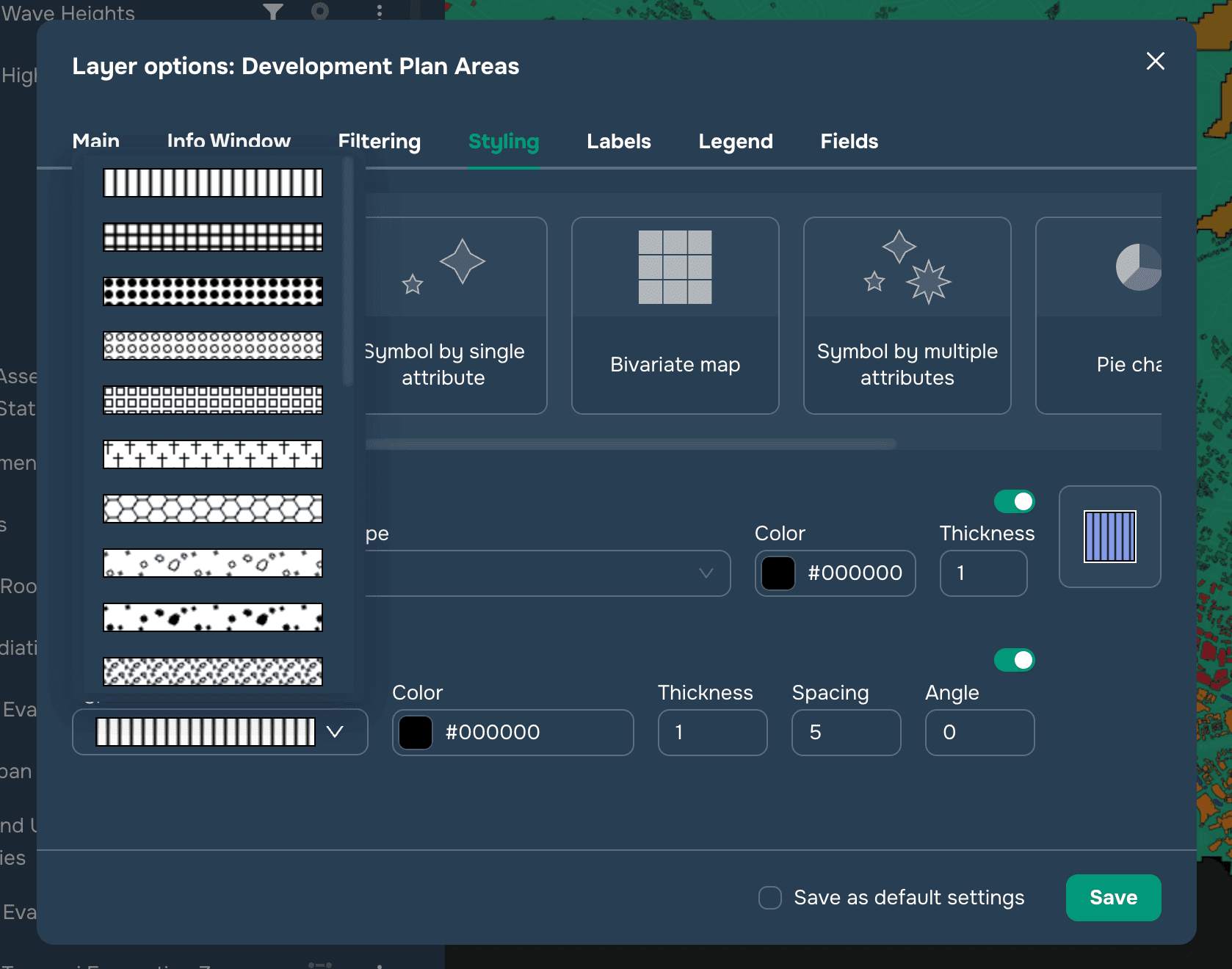
Puede personalizar el tamaño, el relleno, el borde y el tramado para objetos poligonales (véase la Figura 4), y el trazo y el patrón de línea para objetos lineales (véase la Figura 5).

Símbolo por atributo único
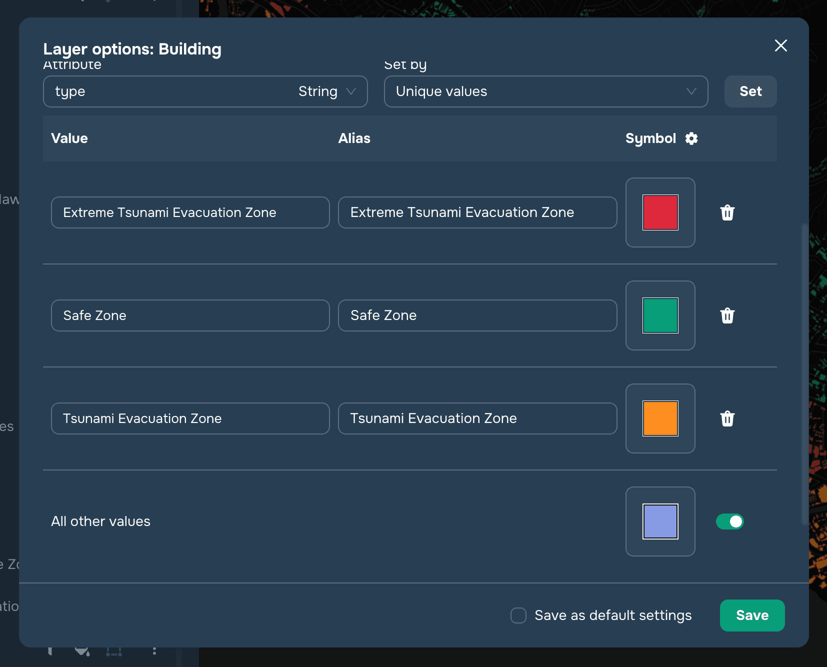
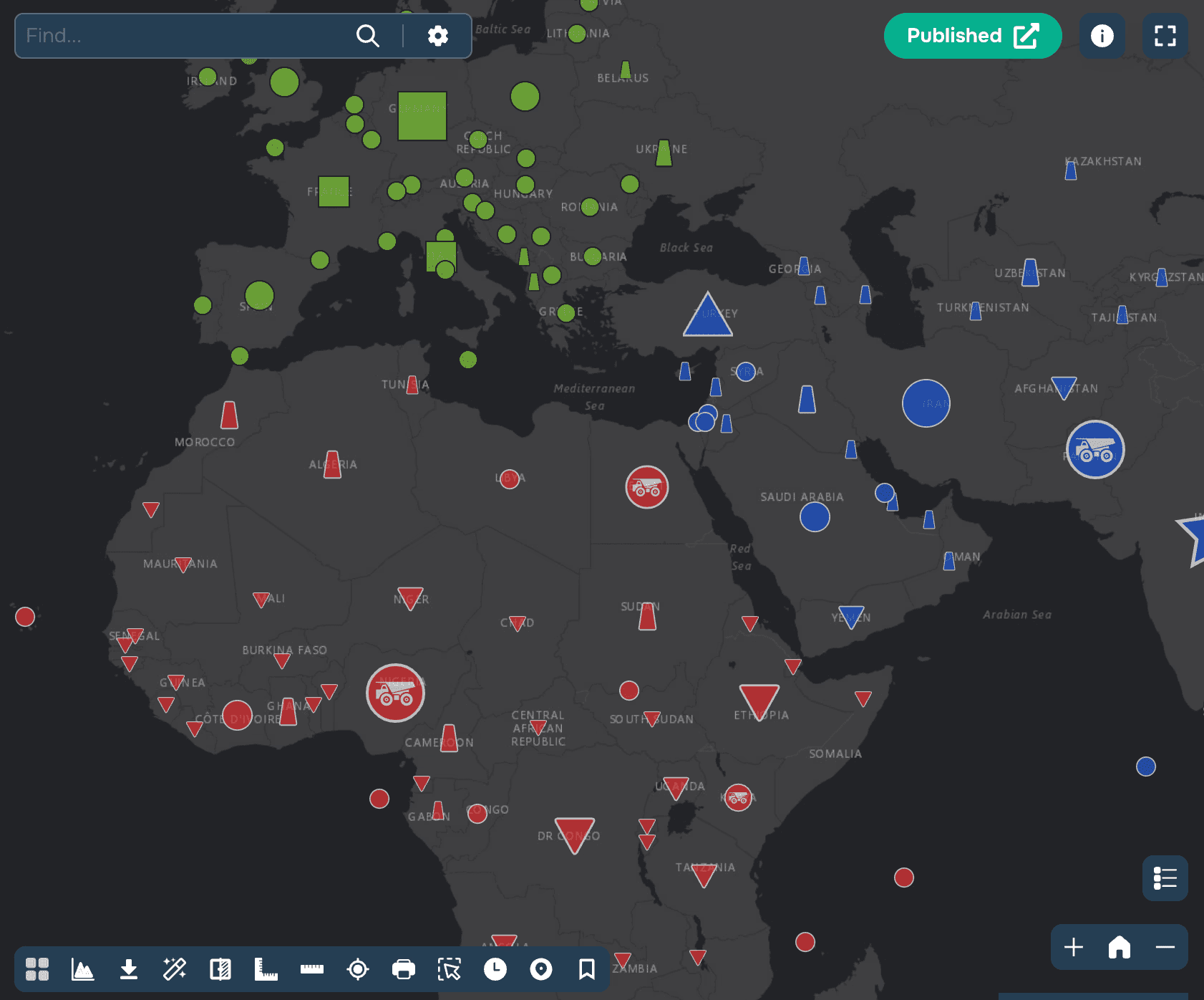
Este estilo es aplicable a todos los elementos espaciales y se refiere a una visualización establecida por uno de los atributos de la capa. Para hacerlo, seleccione un atributo de la lista desplegable y luego configure el estilo para los valores de este atributo.
Para atributos de texto, es posible cargar automáticamente todos los valores seleccionando el método "Valores únicos" y haciendo clic en el botón "Establecer" (ver Figura 1).
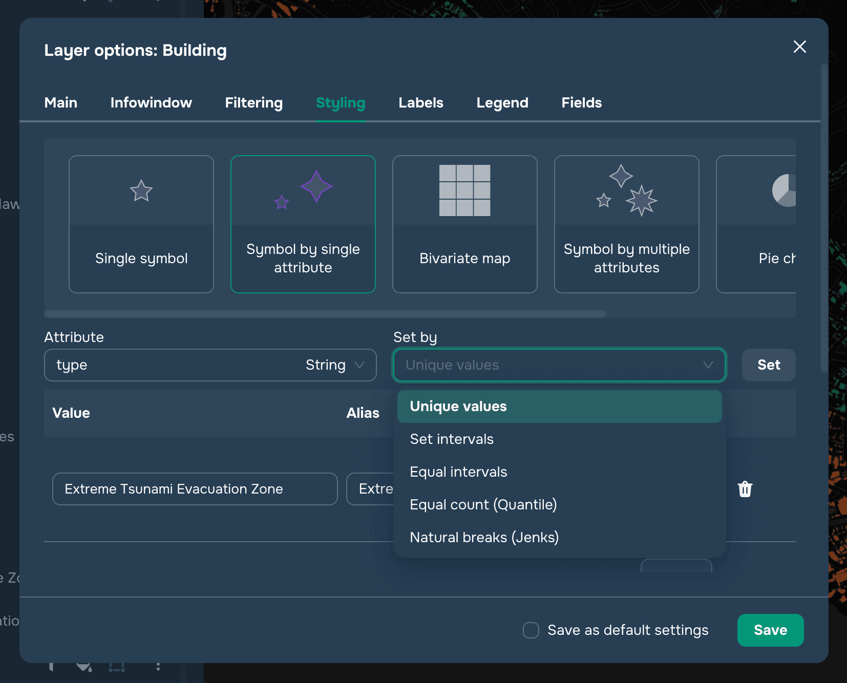
Para atributos numéricos, puede establecer intervalos utilizando los siguientes métodos (ver Figura 1):
Intervalos iguales es un método que dividirá el rango de valores en clases de igual tamaño. Por ejemplo, se crearán tres clases para el rango de valores de 0 a 300 con los siguientes rangos: 0 — 100, 101 — 200, 201 — 300.
Número igual (cuartil) es un método que dividirá el rango de valores en clases iguales al número de objetos dentro de cada clase.
Rupturas naturales (optimización de Jenks) es un método que dividirá el rango de valores en clases, cuyas diferencias entre valores serán máximas.
Ahora puede establecer el estilo del símbolo para cada uno de los valores establecidos por separado o aplicar la configuración general a todos los valores haciendo clic en el icono de "Engranajes" junto a la palabra Símbolo (ver Figura 2). La configuración general incluye seleccionar una paleta o relleno, y establecer la apariencia y tamaño del símbolo.
También puede especificar alias de valor para el widget de Leyenda .


Símbolo por múltiples atributos
Este estilo es aplicable a capas de Puntos y se refiere a una visualización ajustada por varios atributos de la capa. Aquí puedes establecer la visualización de atributos en tres categorías (ver Figura 1):

Por símbolo
Por color
Por tamaño
Para hacerlo, selecciona el atributo para cada categoría y la forma en que se configurará: Valores únicos o tipos de intervalo (ver Símbolo por un solo atributo). También puedes configurar los valores y estilos manualmente.
También puedes especificar alias de valor para el widget de Leyenda.
Mapa bivariado
Este estilo es aplicable a todos los tipos de geometría, pero se utiliza más a menudo para capas poligonales. En este caso, la estilización se basa en 2 atributos numéricos, para cada uno de los cuales se generan 3 intervalos y, en consecuencia, 3 colores. Luego, estos colores se intersectan y se obtiene una matriz de 3x3 con 9 colores. En otras palabras, el estilo coroplético bivariado muestra la dependencia de dos atributos entre sí y permite representar esto de manera clara en el mapa. En la configuración del estilo (Figura 1), debes seleccionar atributos numéricos, tipos de intervalos (ver Símbolo por atributo único) y colores.
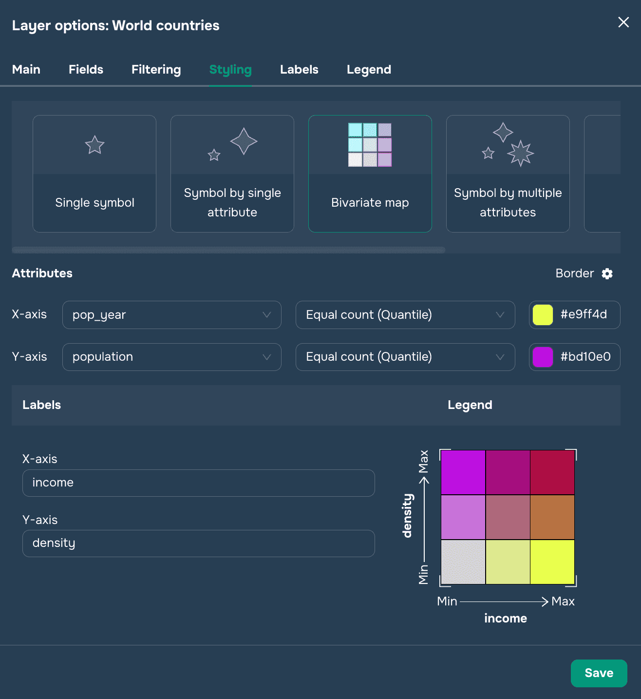
También puedes personalizar las etiquetas del eje y cambiar el borde, símbolo y tamaño (si se configura una capa de puntos) haciendo clic en el engranaje. La Figura 2 muestra la leyenda de este estilo en un mapa.
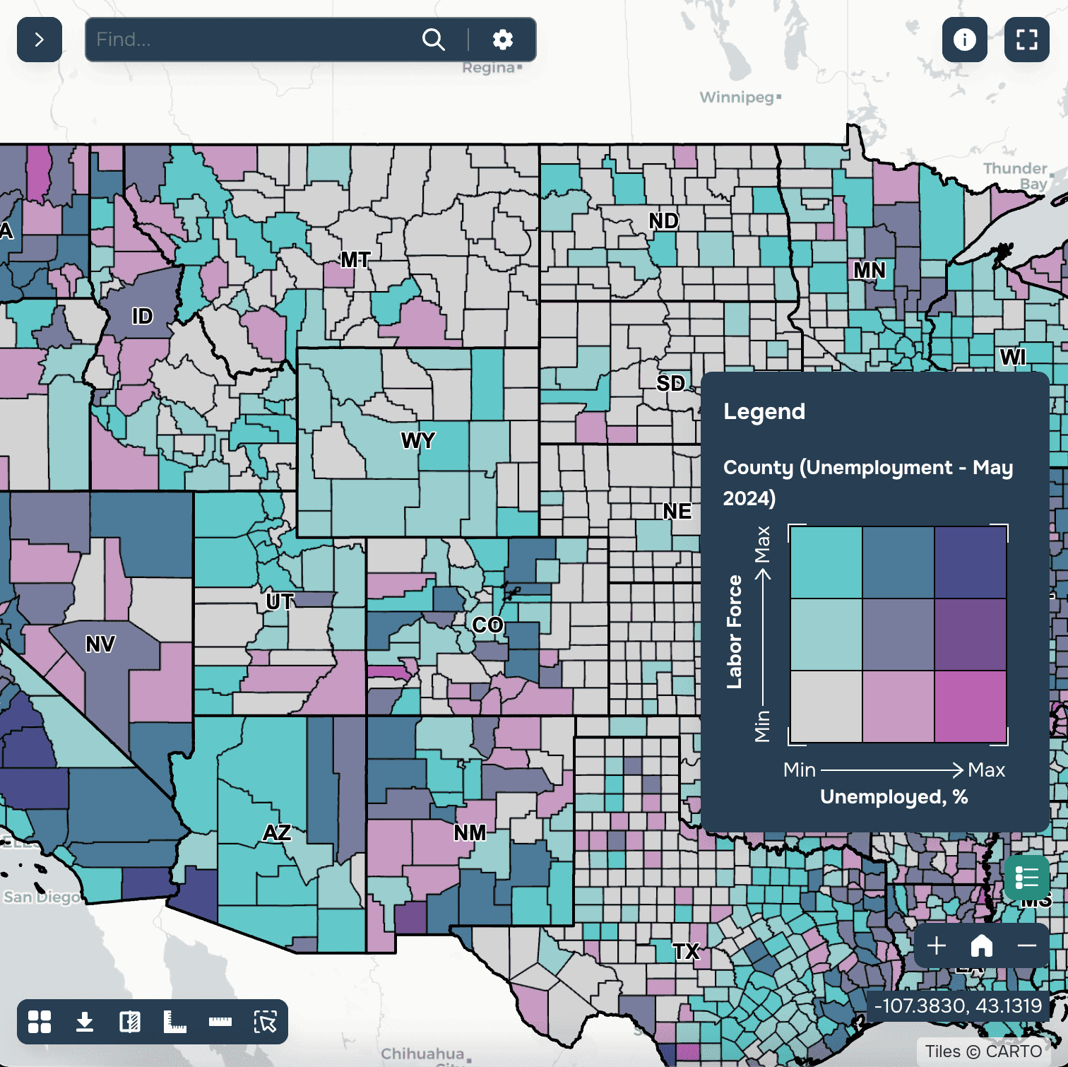
Gráfico de pastel
Este estilo es aplicable para capas de puntos y se refiere a mostrar un gráfico en un punto que está determinado por varios atributos de la capa. Aquí puedes establecer el tamaño del punto (ver Figura 1) basado en un atributo numérico seleccionando una de varias opciones: Valores únicos o tipos de intervalo (ver Símbolo por atributo único).

Además, puedes especificar los campos numéricos utilizados para construir el gráfico de pastel (ver Figura 2). Los sectores se dividen de acuerdo con la participación de cada uno de los atributos en el total para cada objeto (ver Figura 3). El usuario también puede personalizar el tipo de gráfico: Pastel, Donut, Barra. Y elegir un estilo: 2D o 3D (ver imágenes 4, 5, 6)
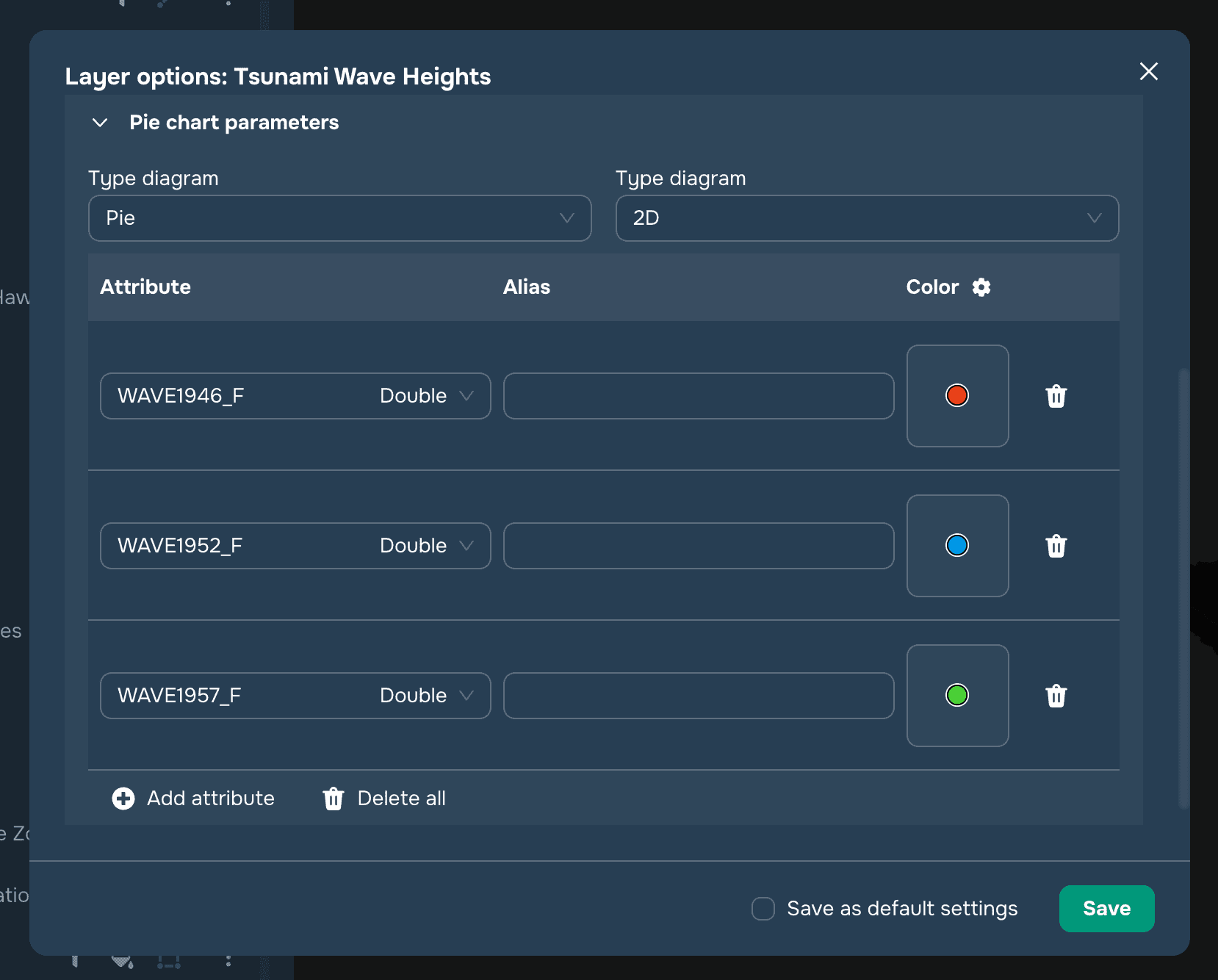
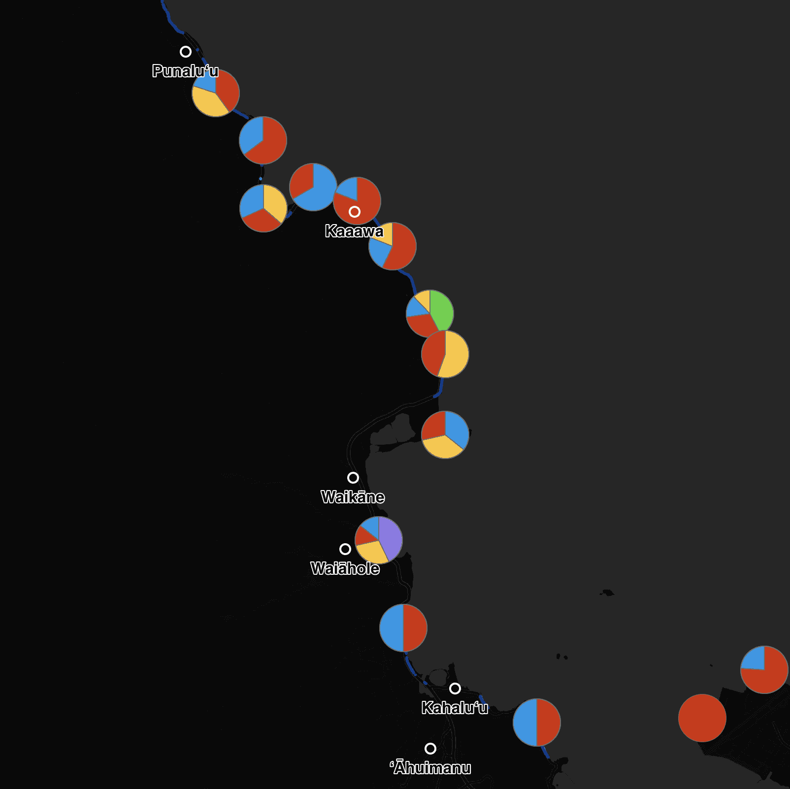
gráfico de pastel


Gráfico de Donut
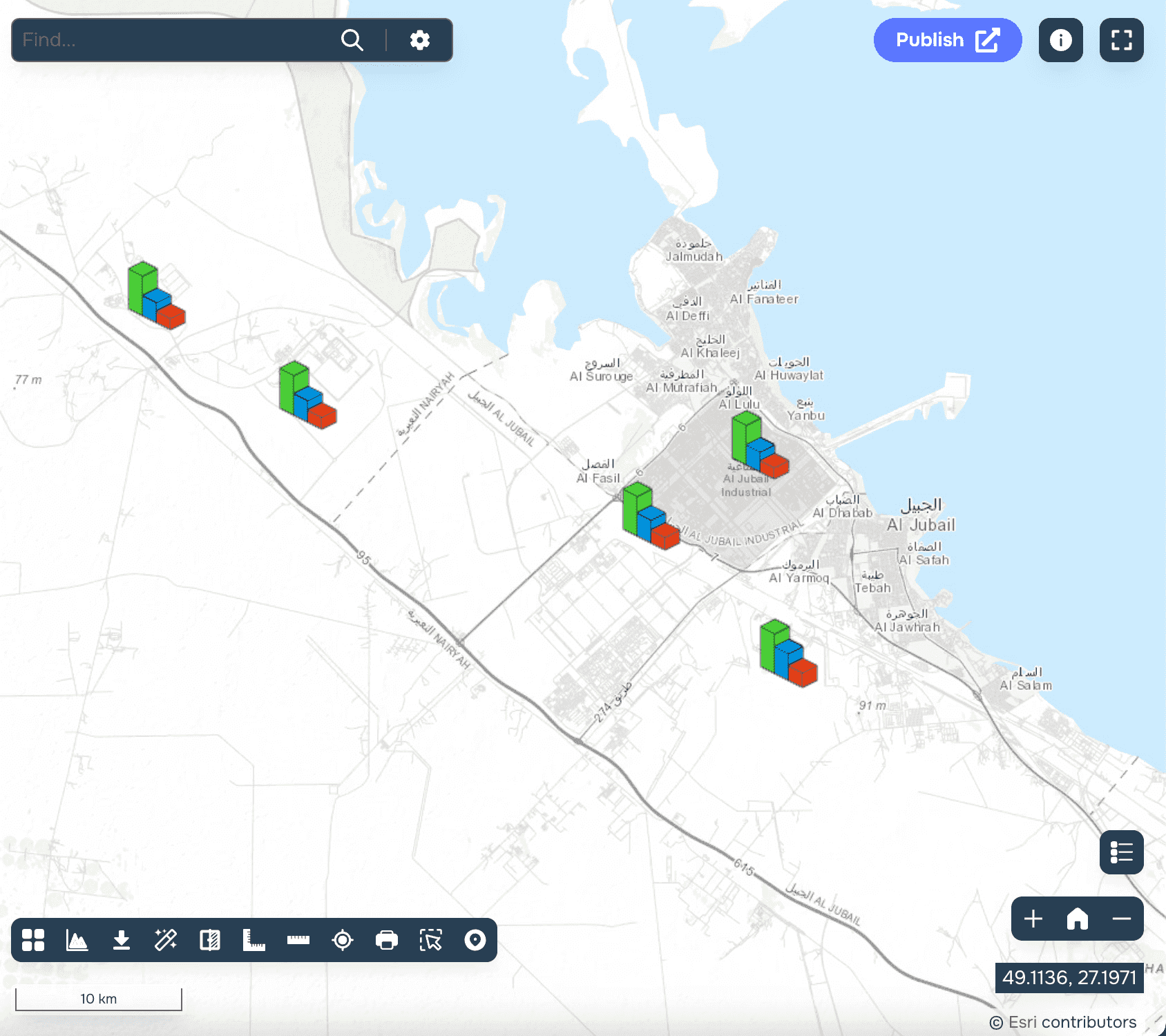
Gráfico de Barra
Mapa de calor
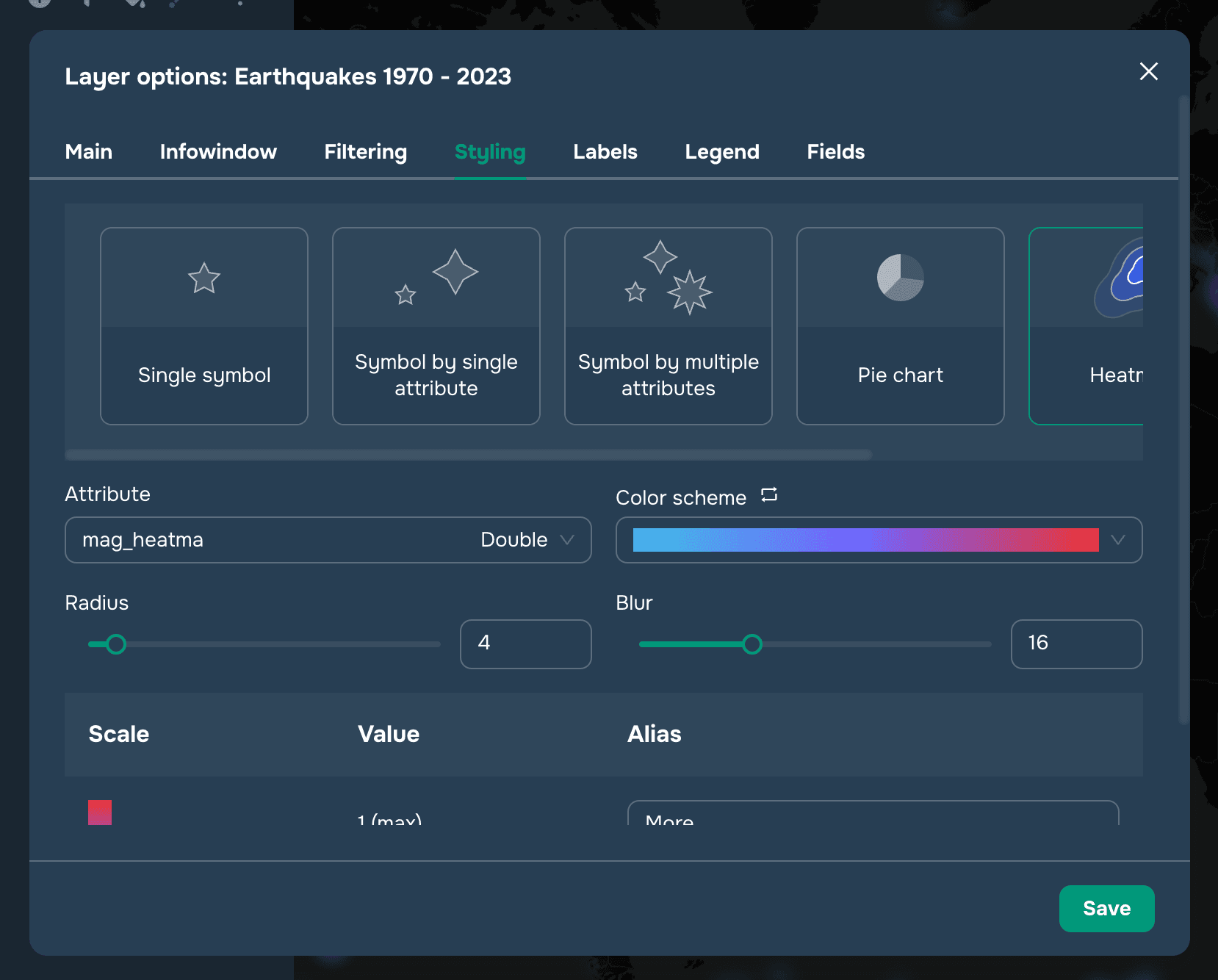
Este estilo es aplicable a geometría de tipo punto y permite que configures la visualización como un mapa de calor. Al configurar este estilo, puedes elegir un atributo numérico para el grado de cambio en la intensidad del color del punto. Si no se selecciona ningún atributo, entonces todos los puntos se establecen a la misma intensidad y se crea un mapa de calor basado en la distribución de densidad de puntos. Si se selecciona un atributo, cada punto será pesado por el valor del atributo. Un peso de punto puede variar de 0 a 1. Si el valor es mayor que 1, entonces el peso del punto se establece en 1. Si el valor es menor que 0, entonces el peso del punto se establece en 0. Por lo tanto, se necesita un atributo con un valor ponderado entre 0 y 1 para obtener resultados correctos.
También puedes cambiar las paletas de gradiente, el radio del punto y su desenfoque. En la columna "Alias", se puede establecer el rótulo para el widget de Leyenda.