
Demographic maps are one of the most visual ways to analyze population data. They allow you to quickly see where people live, how the population is distributed, and which regions differ in density or population.
This guide describes the process of creating a demographic map using geographic information systems.
1. Data Requirements
To create a demographic map, you need two types of data:
Statistical Data
Contains quantitative indicators:
population size
population density
data by region or city
dynamics (by year, if available)
Spatial Data
Contains the geometry of objects:
administrative boundaries (polygons)
points of settlements
In an ideal scenario, this data is already combined. That is, the vector file contains statistics. This is not the case with all sources, so it is important to keep this in mind.
2. Data Sources
Both global and national sources are used to create demographic maps. Most projects use a combination of multiple datasets. It's best to start with basic demographic indicators: population size, population density, and age and sex distribution.
Global Sources
WorldPop – Highly detailed population data
GHSL – Population and development data
Natural Earth – Basic administrative boundaries
GADM – Detailed administrative levels
OpenStreetMap – Geometry of objects and settlements
City data
GeoNames – Global Population Database
SimpleMaps – Ready-made sets of cities with populations
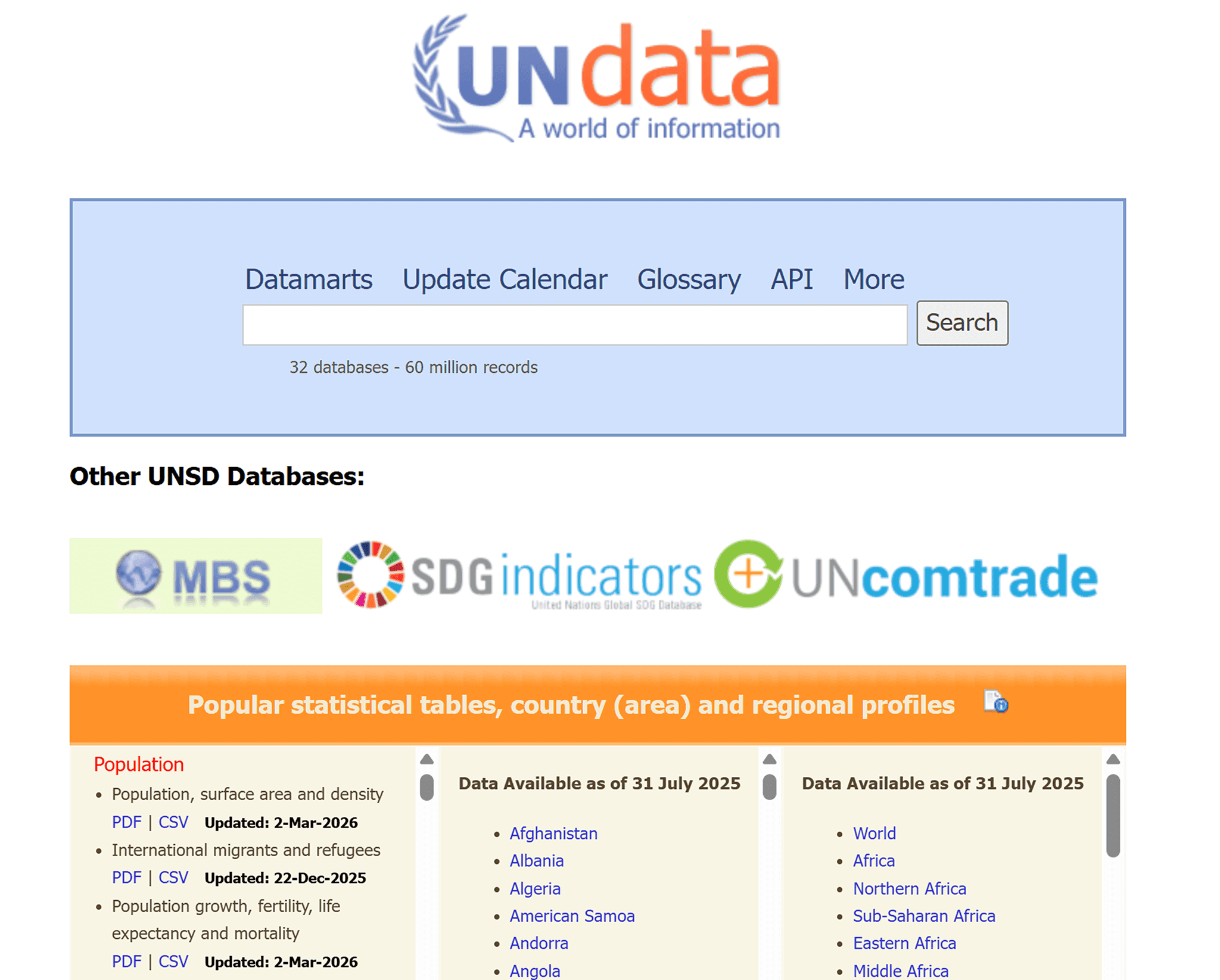
International Statistics
The most commonly used combination is:
boundaries and GADM / Natural Earth
cities and GeoNames / OSM
3. Loading Data
Now we start with the type of data we have.
If you have a vector file with statistics (formats: geojson, geopackage, shp) or a tabular file (formats: csv, xls) with coordinates, then you're in luck! These are ready-made layers that can be added to the platform directly through the Add Data section.
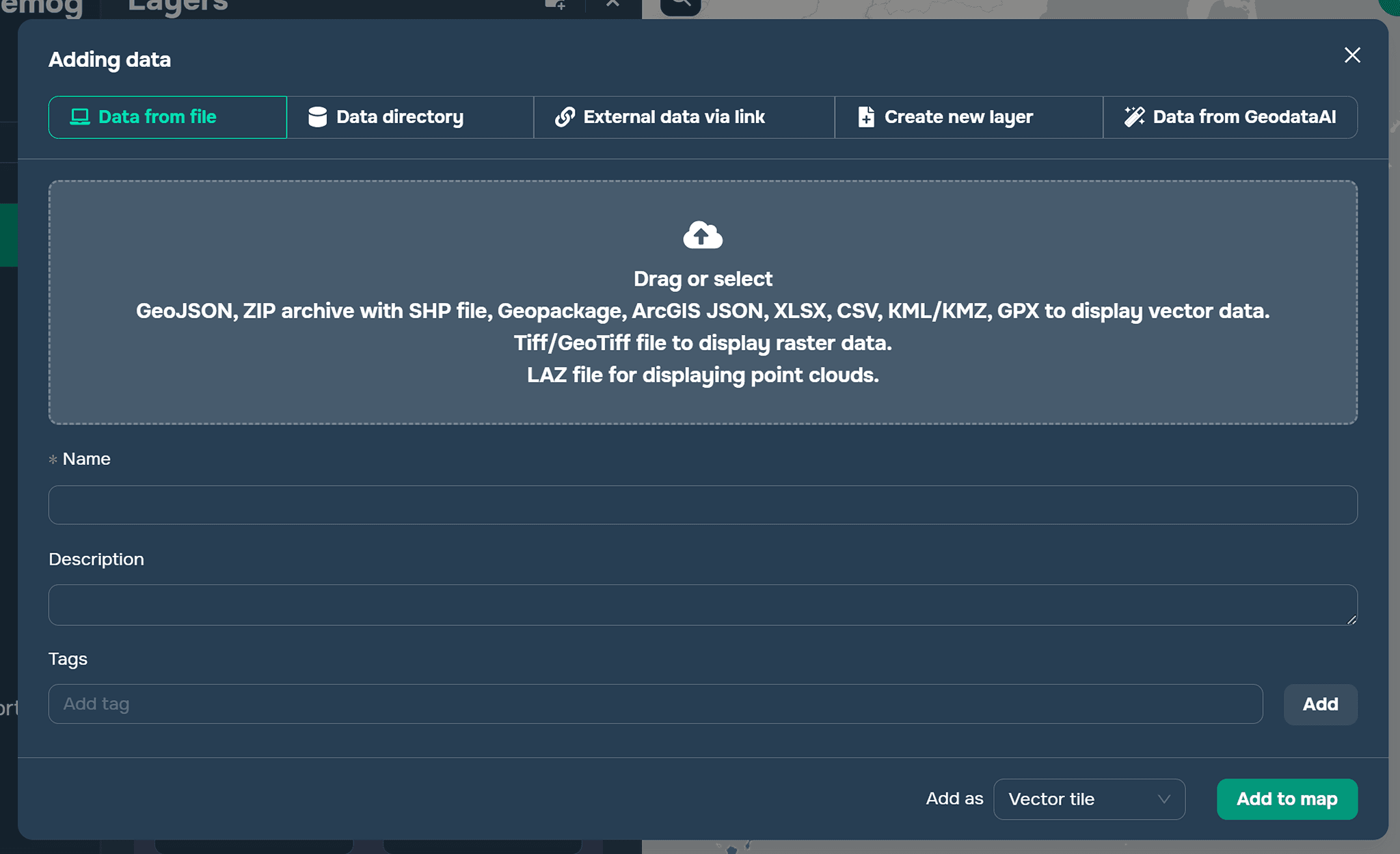
If the data is only available in a table without coordinates, this table must be linked to the vector of the territorial units for which statistics are compiled. For example, a point layer of these cities must be linked to the city data. This can be done in any geographic information program. For example, in QGIS, this is done using the Join tool in Layer Properties. The key field for the link can be the names of the territorial units or the unique territory IDs assigned by the statistical service in the selected country.
4. Configuring Visualization
To clearly display the demographic situation in a country/region/continent, you need to add at least two layers: a point layer and a polygon layer.
A polygon layer should show relative indicators, such as population density. A point layer can show absolute indicators, such as population size.
Point layer (cities)
Type: Circle
Parameter used to set the stylization: Population
Stylization: Size and color
Allows you to:
Highlight major cities
See population distribution
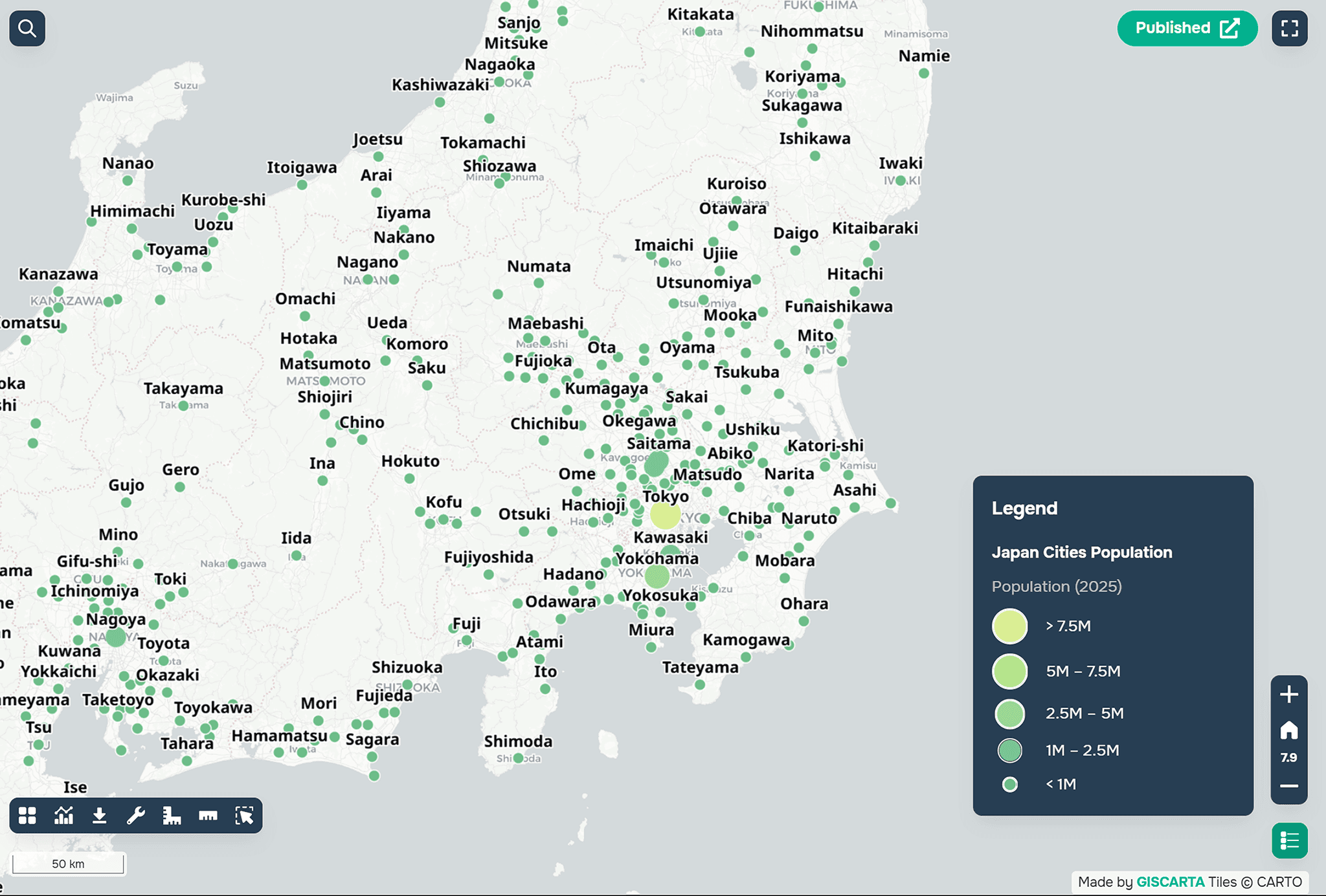
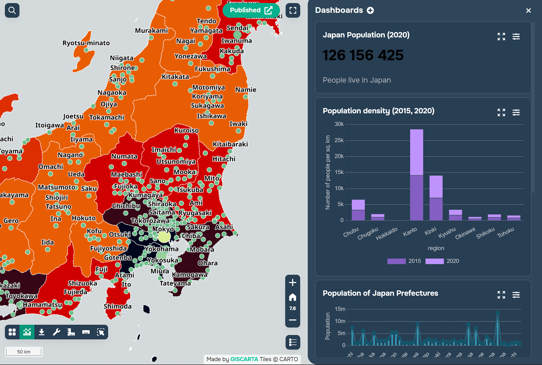
Polygon layer (regions)
Type: choropleth
Parameter used to configure stylization: density
Stylization: color
Allows:
comparing regions
identifying population concentrations

5. Setting up filters
The platform also allows you to set up layer filters to clearly highlight information for specific areas over a specific time period.
We recommend adding:
a population filter
a region filter
a year filter
Filters help analyze data and simplify working with the map.
6. Setting up dashboards
To prevent the map from becoming overloaded with data, you can add dashboards to the platform. These can display additional information in the form of graphs and charts. For example, you can add an age and sex pyramid as a graph in a dashboard.
Dashboards are used for analytics:
total population
regional comparison
dynamics
Summary
Now you have a ready-made map with basic demographic indicators that reflects the current population situation in a given area.
For an example, you can see the Japan demographics project at this link.
FAQ
What data is required to build a demographic map?
You need both statistical data (population, density, indicators) and spatial data (boundaries or coordinates of features).
What should be shown on the map and what in dashboards?
Maps are better for spatial distribution, while dashboards are used for comparisons, trends, and detailed statistics.
What if demographic data is only available as a table?
In this case, the table should be joined to spatial data using a common field such as region name or ID.
Key Takeaways
Combining statistical and spatial data is essential for creating meaningful demographic maps.
Using both polygon and point layers allows you to represent relative and absolute indicators effectively.
Separating visualization (map) and analysis (dashboards) makes the project clearer and easier to interpret.


