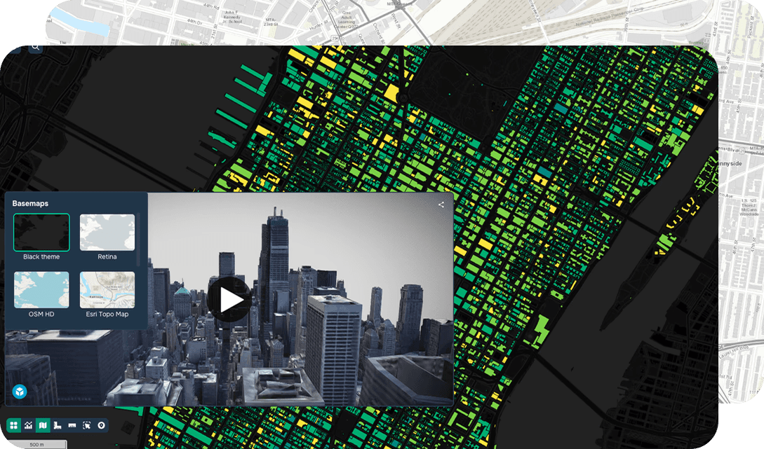
Chart Symbology
Definition
Chart symbology defines how information is visually encoded on maps and diagrams using colors, shapes, and line styles. Effective symbology improves comprehension and reduces misinterpretation. The goal is clarity, not decoration. Well-designed symbols allow users to understand complex information quickly and accurately, especially in critical or time-sensitive contexts.
FAQ
What is chart symbology in GIS?
Chart symbology in GIS refers to the visual system used to represent spatial data on maps and diagrams through colors, shapes, and line styles. It provides a standardized way to encode geographic information so that map readers can quickly interpret complex datasets. Effective symbology is designed for clarity and accuracy, not decoration, making it essential for reliable geospatial communication.
How is GIS used to apply chart symbology to geospatial data?
GIS platforms like ArcGIS and QGIS allow users to assign symbology rules to map layers based on attribute data, such as using graduated colors to show population density or proportional symbols to represent earthquake magnitude. Cartographers can configure symbol renderers, classification schemes, and color ramps directly within the GIS software to match the needs of their spatial analysis. This process transforms raw geospatial data into visually meaningful map outputs that support decision-making.
What are the practical benefits of using well-designed chart symbology in mapping projects?
Well-designed chart symbology helps users understand complex spatial information quickly and accurately, which is especially critical in time-sensitive environments like emergency response or urban planning. Consistent and intuitive symbol design reduces the risk of misinterpretation, improving the reliability of data-driven decisions across sectors like public health, transportation, and environmental monitoring. Clear geospatial visualization also makes maps more accessible to non-specialist audiences, broadening the impact of GIS analysis.
What technical considerations should GIS professionals keep in mind when implementing chart symbology?
When implementing chart symbology, GIS professionals must carefully select classification methods such as natural breaks, quantile, or equal interval to ensure that symbol variations accurately reflect the underlying data distribution. Color choices should account for color blindness accessibility and should follow established cartographic standards, such as using sequential color ramps for continuous data and diverging schemes for data with a meaningful midpoint. Symbol scale dependency should also be configured so that map layers render appropriately at different zoom levels within the GIS environment.