
A map is primarily a visualization tool, but in most cases it's not enough for comprehensive analysis. When data becomes overwhelming, new questions arise: how to compare values, how to track changes over time, how to quickly find the information you need. In such situations, the map becomes part of a more complex interface: a dashboard.
A dashboard combines a map, graphs, and filters, allowing you to not just view the data but also work with it.
What is a GIS dashboard
A GIS dashboard is an interface that complements a map with analytical elements. It allows you to simultaneously see spatial distribution and numerical indicators.
Typically, a dashboard includes:
a map as the main element
graphs and charts
filters for working with data
When is a dashboard truly needed
A dashboard becomes essential when there is more data than can be conveniently displayed on a map. This is especially true for tasks where comparison, dynamics, and detail are important.
For example:
demography: comparing regions and population structure
transportation: analyzing flows and accessibility
business: assessing sales and coverage areas
ecology: monitoring changes
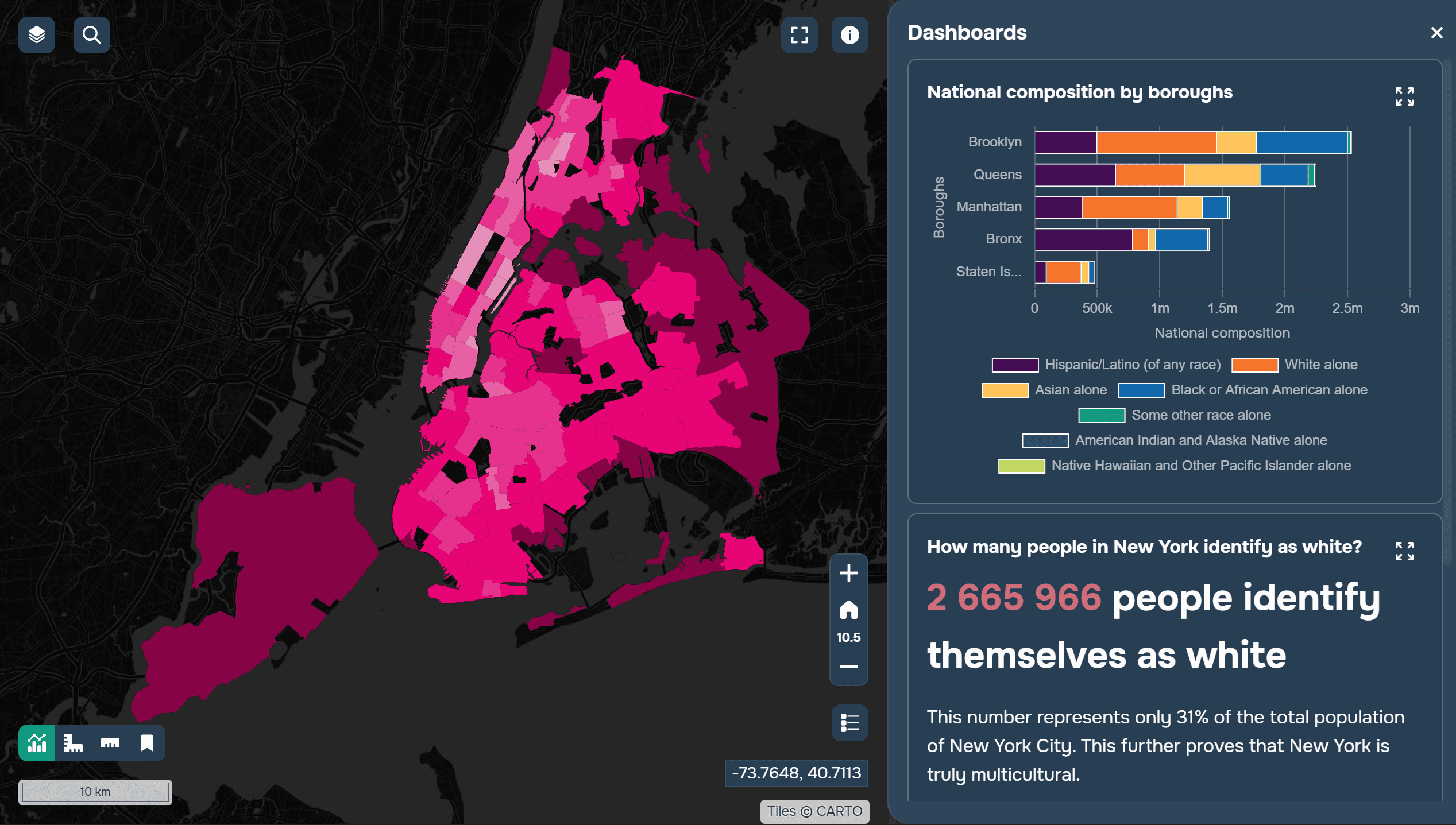
A mapping project about the population of New York City, displaying some data in a dashboard format. Created using GISCARTA.
If a map begins to become overloaded with layers and labels, it's a sign that it's time to move some of the information to a dashboard.
Principles of a Good Dashboard
The first principle is simplicity. The fewer unnecessary elements, the easier it is for the user to navigate.
The second principle is layout logic: information should be read from top to bottom and left to right. Key indicators are typically placed at the top, with graphs below, and the map remains the central element.
The focus should be on the essentials. If the user doesn't understand where to look first, the dashboard is overloaded.
What to show on the map and what to show in the dashboard
The most common mistake when assembling a mapping project is trying to show everything on the map. This makes it complex and unreadable. A map is best suited for:
displaying geography
identifying spatial patterns
visually comparing areas
A dashboard is used for:
graphs and charts
comparing indicators
analyzing trends
For example, population density makes sense to show on a map, while age structure can be shown as a graph. This approach makes the information clearer.
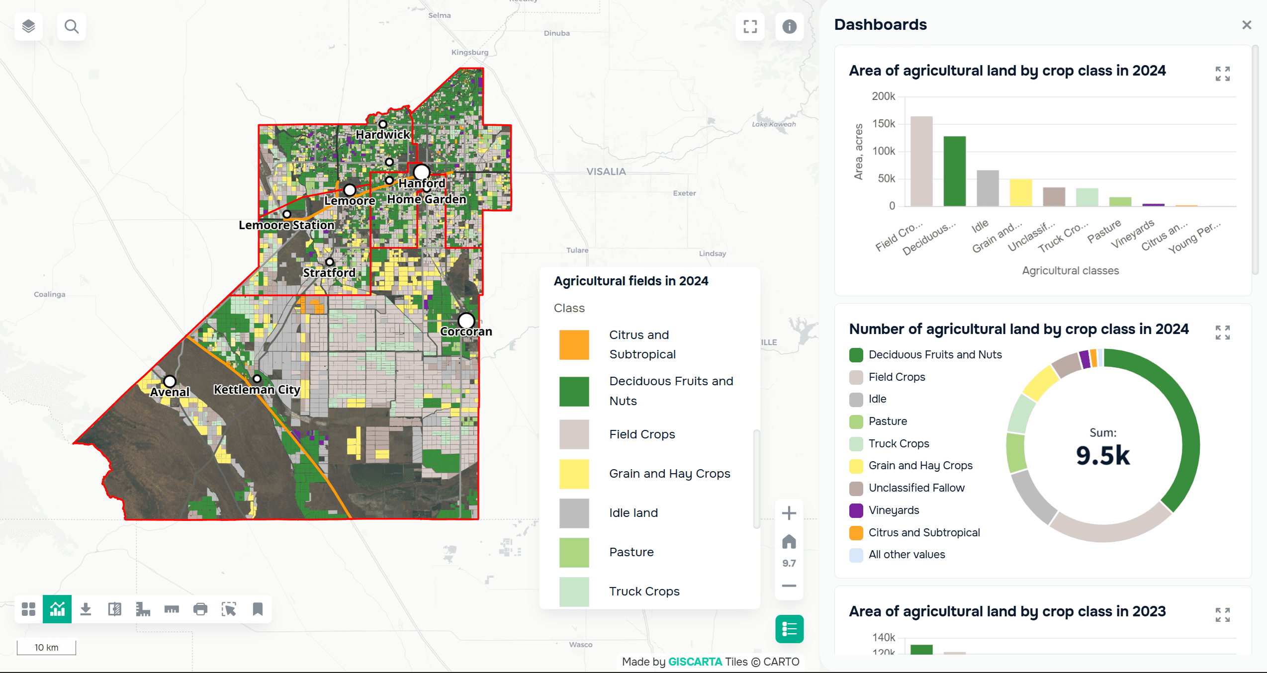
A mapping project about the agricultural territories of Kings County, displaying the distribution of agricultural crops in dashboard format. Created using GISCARTA.
Basic Dashboard Elements
A good dashboard is usually built from several key blocks.
A KPI block allows you to quickly see key indicators: the overall value, averages, or key metrics.
Graphs are used for comparison and analysis. These can be bar charts, pie charts, or lines to show trends.
Filters allow the user to manipulate the data: select a time period, regions, or value ranges.
Tables add detail when deeper analysis is required.
Interactivity
A dashboard only becomes truly useful when it is interactive. Filters should affect the map and graphs, and user actions should change the data displayed. For example, when you select a region on the map, the graphs should automatically update. Hovering over an object can reveal tooltips with additional information, and clicking can reveal a more detailed level of data.
Interactivity transforms a dashboard from a static image into an analytical tool.
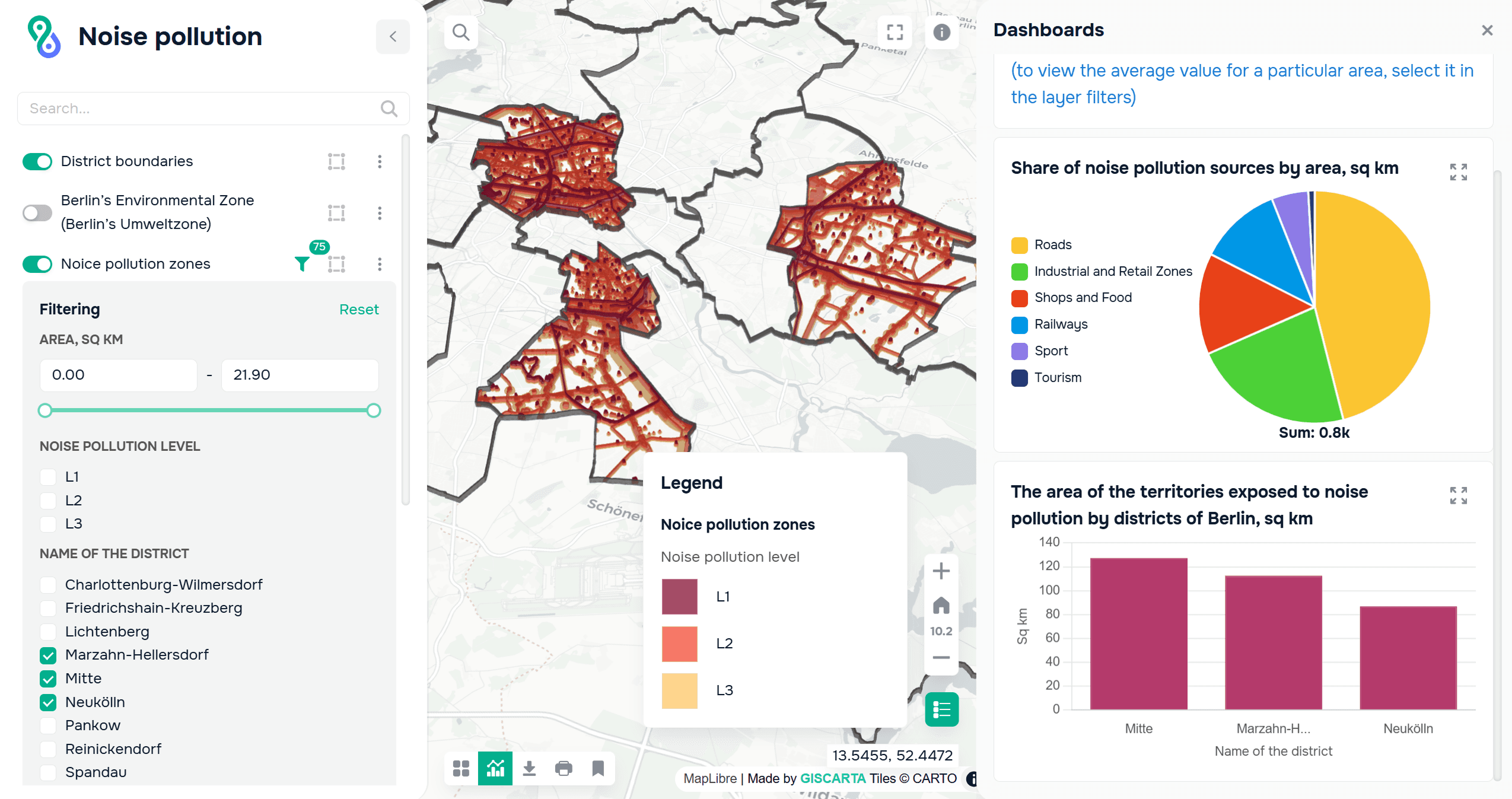
A mapping project about noise pollution in Berlin. Dashboards display the pollution area by district, which can be selected using layer filters. Created using GISCARTA.
Tools
Various tools are used to create dashboards. QGIS is suitable for data preparation and basic visualization. Web platforms such as GISCARTA allow you to create interactive dashboards and work with maps directly in the browser. You can learn more about how to add dashboards to GISCARTA here.
BI tools such as Power BI and Tableau, which can be integrated with geodata, are also widely used.
Example Scenario
Let's consider a simple example: a city demographic dashboard.
The map shows population density by district.
The graph shows age structure.
A filter allows you to select districts or years.
This approach allows you to quickly understand both the distribution and structure of the data.
FAQ
How do you know if a dashboard is overloaded?
If the user can't locate the main information within a few seconds, there are too many elements or they're poorly structured.
Should interactivity always be added?
Not necessarily. If the goal is a quick presentation, a static dashboard is sufficient. Interactivity is needed where the user needs to explore the data.
How do I choose which metrics to include in my KPIs?
I recommend choosing indicators that answer the dashboard's main question. Everything else is best left in charts or filters.
Key Takeaways
A dashboard helps structure the data and makes the map more understandable.
Separating the map from the analytics improves readability.
Simplicity and logic are more important than the number of elements.


