
Color is one of the most important elements of cartographic visualization. It helps users quickly identify patterns, compare areas, and interpret data. However, an incorrectly chosen palette can distort the perception of information and make the map difficult to analyze.
Let's look at the basic principles of choosing map colors and useful tools that will help you create clear and accessible visualizations.
Basic Types of Color Palettes
Before choosing colors, it's important to determine the type of data you want to display.
Qualitative Palettes
Qualitative palettes are used to display independent categories. For example:
land use types;
administrative districts;
infrastructure categories;
vegetation types.
In these palettes, colors should not create a sense of order or hierarchy. All categories should be perceived as equal.
Sequential Palettes
Sequential palettes are used for quantitative indicators. For example:
population density;
precipitation;
surface temperature;
income level.
Such palettes are typically based on a gradual change in color brightness or saturation. Users intuitively perceive the transition from lower to higher values.
Diverging Palettes
Diverging palettes are used for data that has a central reference point. For example:
temperature deviation from normal;
population growth and decline due to migration;
changes in indicators relative to the mean.
These schemes use a neutral central color and two directions of change in the indicator.
Viridis
Viridis is considered one of the most popular color scheme sets today.
Viridis palettes were developed specifically for scientific data visualization and take into account the peculiarities of human color perception. They are clearly visible even to users with color vision impairments and maintain legibility in black and white printing.
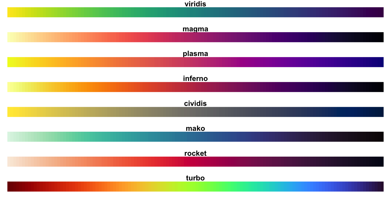
Viridis palette series
Viridis, Magma, and Cividis are particularly commonly used for maps.
ColorBrewer
If you need to quickly select a high-quality palette for a map, ColorBrewer remains one of the best solutions.

This tool was created by cartographers Cynthia Brewer and Mark Harrower and has been considered the standard for choosing color schemes for thematic maps for over twenty years. In ColorBrewer, you can:
select the data type;
specify the number of classes;
check the palette for color blindness compatibility;
Select consistent, high-quality, and divergent patterns.
The tool's authors emphasize that for most choropleth maps, it is recommended to use no more than 5–7 color gradations.
CARTO Colors
CARTO Colors palettes are often used for web mapping. They were developed for interactive maps and analytical dashboards. Many schemes meet modern interface readability requirements and work well on various screen types.

The catalog includes palettes for:
categorical data;
quantitative indicators;
divergent values.
GeoPalettes
The GeoPalettes project is an interesting solution for remote sensing and geoanalytics. It contains ready-made color schemes for displaying:
temperature;
precipitation;
terrain;
air quality;
climate indicators;
oceanographic data.
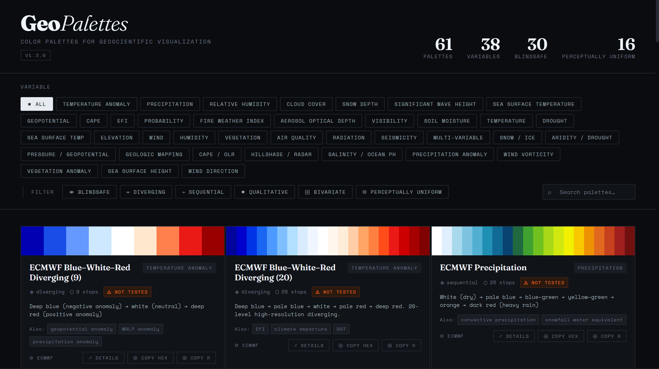
One of the project's advantages is the ability to export palettes to QGIS via XML files.
Why is color blindness important to consider?
According to various estimates, color vision deficiency affects approximately 8% of men and about 1% of women.
The most common difficulty is distinguishing between red and green hues. Therefore, classic red-green color schemes can be difficult to read for a significant portion of the audience.
Modern tools allow you to check palette availability in advance. For this purpose, you can use:
Mistakes in Color Selection
Rainbow Palette (Jet / Spectral)
Despite their popularity, rainbow palettes are considered one of the most controversial in data visualization. The main problem is the uneven distribution of brightness. Yellow hues are visually more noticeable than others and can draw attention to average values instead of extreme ones.
For this reason, many experts recommend replacing Jet with Turbo or Viridis.
Red-Green Schemes
Another common mistake is using red-green palettes to display opposing values.
While this scheme seems intuitive, it is difficult for people with color blindness to perceive and can obscure differences between categories.
Safer alternatives include:
blue-orange palettes;
violet-yellow schemes;
Viridis palettes.
Tools for Choosing Color Schemes
If you need to choose or test a palette, you can use the following resources:
FAQ
What palette type should I use for a temperature map?
Sequential palettes are most often used to display temperature, while divergent palettes are used for temperature anomalies.
Why is ColorBrewer considered a standard in cartography?
Because the service offers scientifically validated palettes adapted to different data types and color vision deficiencies.
Can I use a rainbow palette for maps?
Technically, it is possible, but it often distorts the perception of the data due to uneven color brightness. Viridis or Turbo are usually recommended.
Key Takeaways
The choice of color palette depends on the type of data: qualitative, sequential, or divergent.
Viridis, ColorBrewer, CARTO Colors, and GeoPalettes are among the most popular resources for cartographic visualization.
A good map should not only be visually appealing but also accessible to users with different color vision types.


