
Maps are great at displaying data, but they don't always help with understanding it. Users may see the distribution but not grasp the meaning or relationships. This is especially noticeable in projects with large volumes of data. In such cases, storytelling – a format that transforms a map into a clear and coherent story – comes to the rescue.
What is a Story Map
A story map combines a map, text, and visual elements into a single narrative. Unlike a traditional map, it's not just the data layer itself that's important, but also how it's presented.
Typically, a story map includes:
a map as the main visual element
text description
images or graphics
interactive elements
This approach allows you to not just display the data, but also explain it and guide the user through its analysis.
Why Use Story Maps
The main goal of story maps is to simplify data understanding through interactivity. This is especially important when the audience isn't a GIS expert. Story maps are used:
to present analytical projects
in journalism and data storytelling
in urban studies and ecology
in business to explain data
For example, instead of a simple population density map, you can show how it varies by region, adding explanations and visualizations so the user can quickly understand the key findings.
Types of Story Maps
There are several approaches to constructing stories on a map.
Linear Story
The user navigates through a predefined structure, scrolling the page and sequentially reviewing the material. This is the most common format.
Interactive
The user controls the viewing experience: selecting regions, applying filters, and exploring the data.
Data-Driven
The emphasis is on analysis. The map is supplemented with graphs and dashboards that help interpret the data.
Presentation
These are used to demonstrate results where visual presentation and structure are important.
Where Story Maps Are Used
Story maps are actively used in various fields. In journalism, they help explain complex topics, such as migration or climate change. In urban planning, they are used to showcase projects and analyze territories. In business, they are used to visualize markets, logistics, or customer data.
In fact, in any task where it's important to convey the meaning of data, storytelling on a map is an effective tool.
Principles of a Good Storytelling Map
The main principle is simplicity. The story should be clear at first glance. If the user doesn't understand what's happening, the structure is overloaded.
It's important to establish logic: information should be presented sequentially, from the general to the specific.
It's also worth paying attention to visual clarity: minimize unnecessary elements, use clear colors, and avoid overloading the interface.
How a Story Map Is Built
Creating a story map begins with setting a goal. You need to understand the idea you need to convey.
Next, the data is selected and the structure is built: which blocks will be sequential, which maps are needed, where to add text or graphics.
After this, the visualization is created and the user experience is configured. It's important to test how easy the story is to read and whether the logic is clear.
Tools
There are several popular solutions for creating story maps.
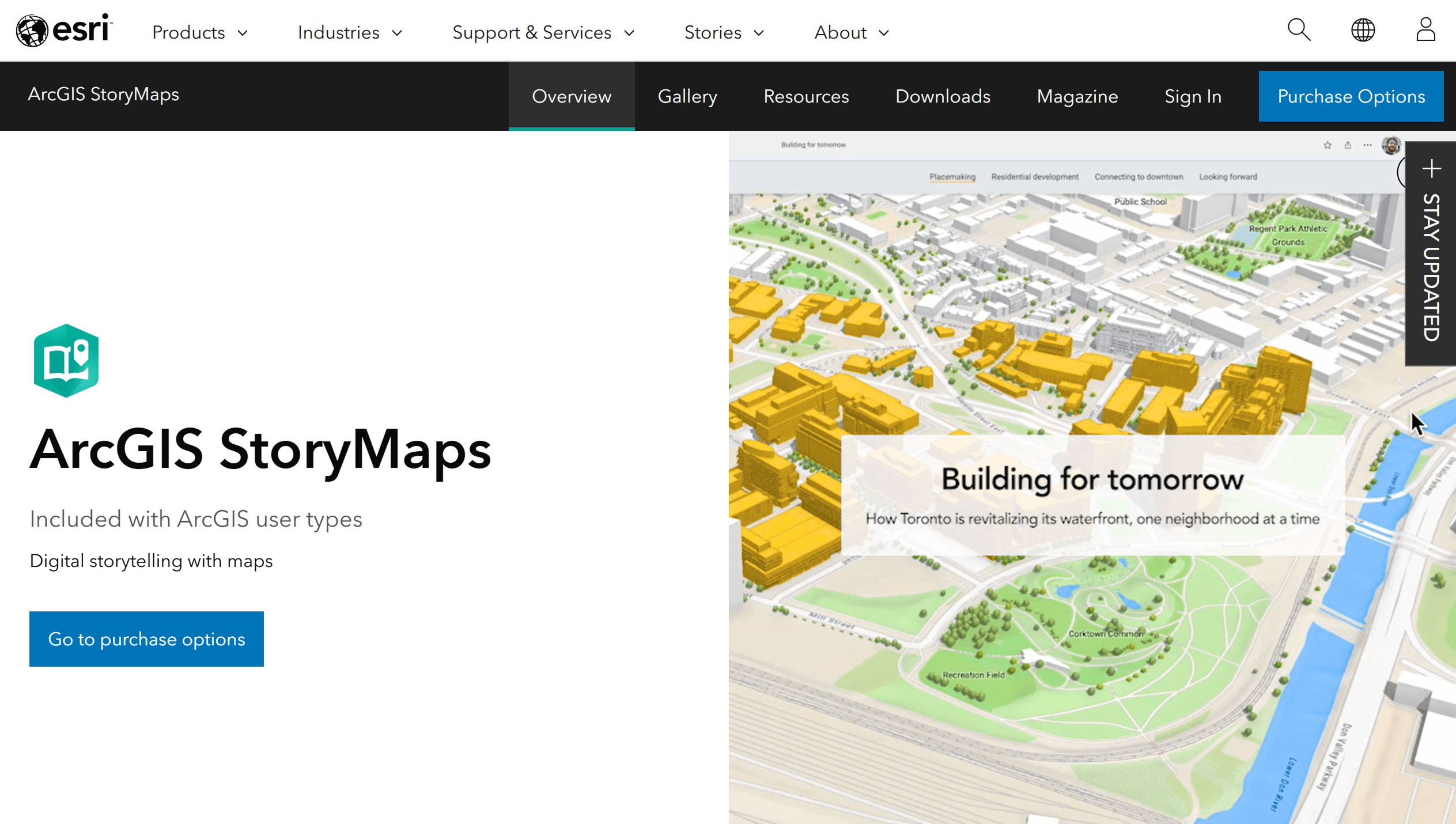
ArcGIS StoryMaps
One of the most well-known tools. It offers ready-made templates and a user-friendly interface for creating stories. It's suitable for presentation projects and journalism. However, the platform is commercial, and customization options are limited to the templates.
GISCARTA
A web platform that allows you to create maps and enhance them with analytics and dashboards. It's more data-focused, making it suitable not only for storytelling but also for analytical projects. The user can combine maps, filters, and graphs to create more flexible scenarios.
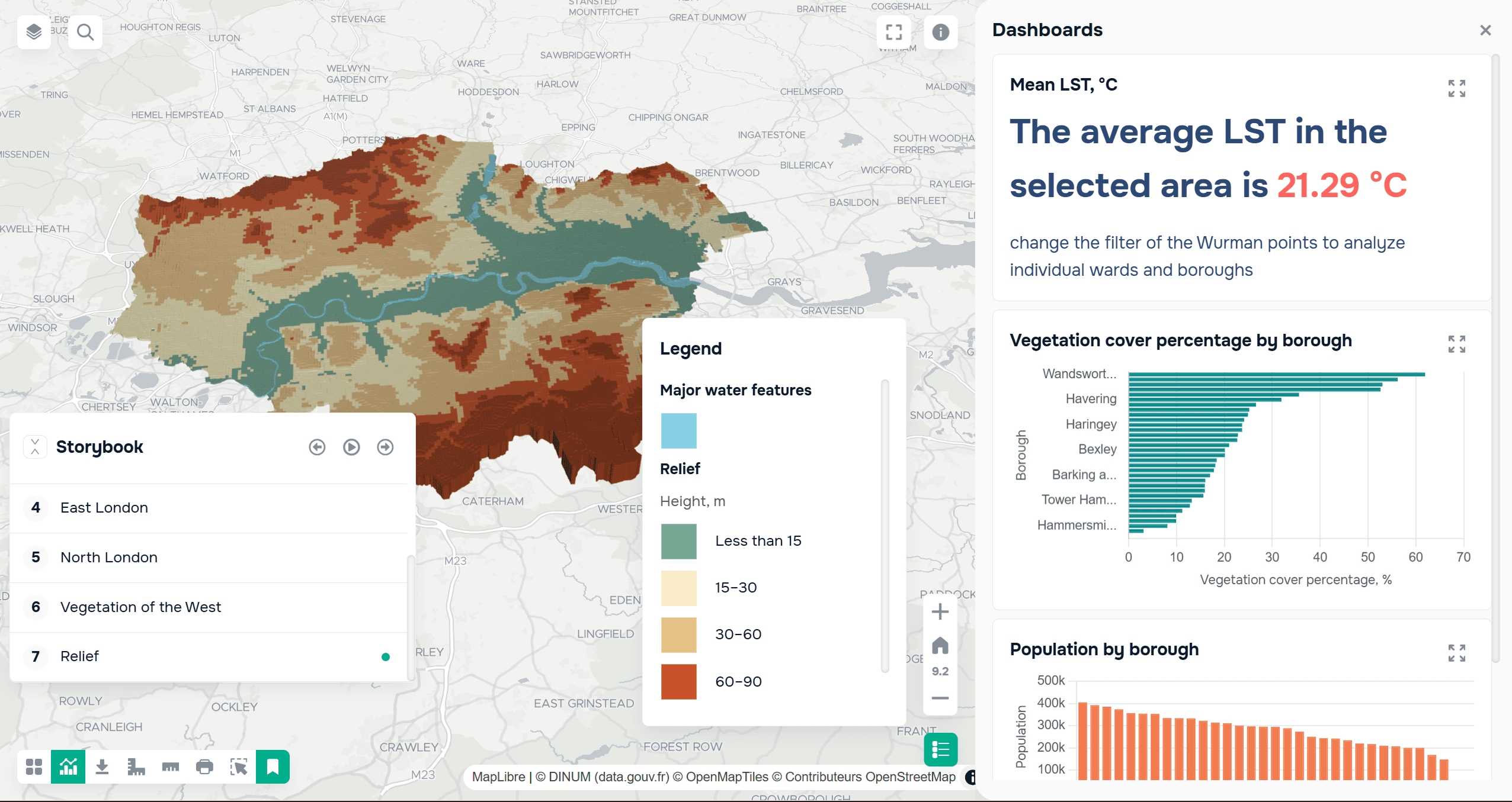
An example of the use of storytelling in a project about the environmental situation in London.
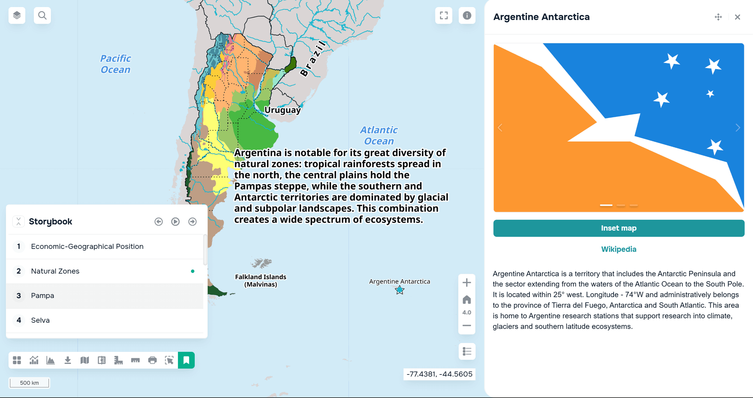
An example of the use of storytelling in a project about the Argentine economy.
More details about how the Storybook widget works on the GISCARTA platform can be found here.
FAQ
When should you use a story map instead of a regular map?
When is it important not just to show data, but to explain it and guide the user through its conclusions?
Do you need to be a designer to create a good story?
No, but it's important to understand the structure and logic of presenting information.
Can story maps be used for analytics, not just presentations?
Yes, especially if you add interactive elements and graphs.
Key Takeaways
Story maps help explain data, not just show it.
A good story is built around a single idea and a clear structure.
The combination of maps, text, and interactivity makes analysis understandable to any audience.


