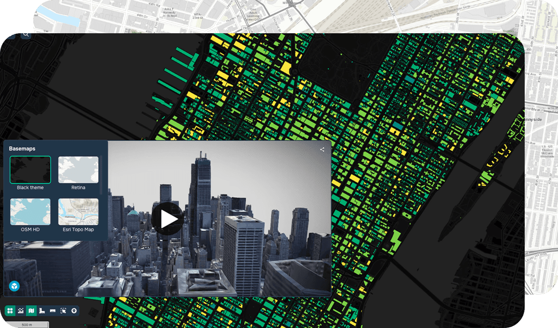
Storytelling with Maps
Definition
Storytelling with maps is a GIS use case that combines spatial analysis, cartographic design, and narrative communication to transform complex geospatial data into compelling, audience-driven experiences. Rather than presenting raw datasets or static maps, this approach leverages GIS technology — including platforms such as ArcGIS StoryMaps, QGIS, and web mapping frameworks — to integrate interactive maps, multimedia content, and guided narratives within a cohesive digital environment.
In practice, GIS professionals apply spatial data visualization techniques, layer-based mapping, and dynamic symbology to contextualize geographic phenomena for both technical and non-technical audiences. Geospatial analysts can embed time-series data, satellite imagery, demographic layers, and field-collected datasets to support evidence-based storytelling across domains including urban planning, environmental monitoring, public health, and disaster response.
The practical benefits are significant. Storytelling with maps increases data accessibility, improves stakeholder engagement, and enhances decision-making by translating geospatial analysis into visually intuitive formats. It bridges the gap between technical GIS outputs and real-world communication needs, making spatial intelligence actionable for policymakers, researchers, and communities alike.
FAQ
What is storytelling with maps in GIS?
Storytelling with maps is a GIS use case that combines spatial analysis, cartographic design, and narrative communication to present complex geospatial data as engaging, audience-driven digital experiences. Rather than displaying raw datasets or static maps, it integrates interactive maps, multimedia content, and guided narratives within platforms such as ArcGIS StoryMaps or web mapping frameworks. This approach makes spatial intelligence accessible to both technical and non-technical audiences across domains including urban planning, public health, and environmental monitoring.
How do GIS professionals apply geospatial technology to map-based storytelling?
GIS analysts use layer-based mapping, dynamic symbology, and spatial data visualization techniques to contextualize geographic phenomena within a structured narrative. They can embed time-series data, satellite imagery, demographic layers, and field-collected datasets to support evidence-based storytelling across a wide range of real-world topics. Tools such as ArcGIS StoryMaps, QGIS, and open-source web mapping frameworks provide the technical infrastructure needed to combine geospatial analysis with compelling visual communication.
What are the practical benefits of using storytelling with maps for stakeholder communication?
Storytelling with maps significantly increases data accessibility, improves stakeholder engagement, and enhances decision-making by translating complex geospatial outputs into visually intuitive formats. It bridges the gap between technical GIS analysis and real-world communication needs, making spatial data actionable for policymakers, researchers, and communities. This approach is particularly valuable in disaster response, public health, and environmental monitoring, where clear geographic communication can directly inform critical decisions.
What are key technical considerations when implementing a map-based story using GIS platforms?
When building a map-based story, GIS professionals must consider data format compatibility, ensuring that spatial datasets are properly projected and optimized for web delivery using formats such as GeoJSON, shapefiles, or hosted feature layers. Responsive design, load performance, and interactive layer management are also critical factors when deploying stories through platforms like ArcGIS StoryMaps or custom web mapping applications. Integrating well-structured metadata and accessible cartographic design further ensures that the final geospatial narrative is both technically sound and user-friendly.