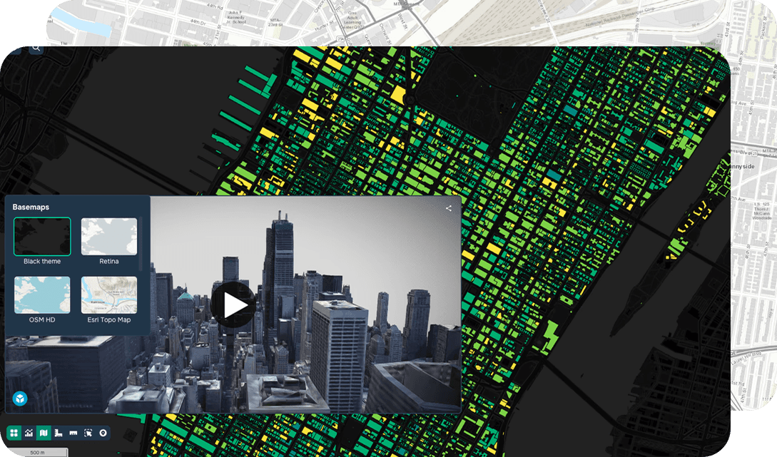
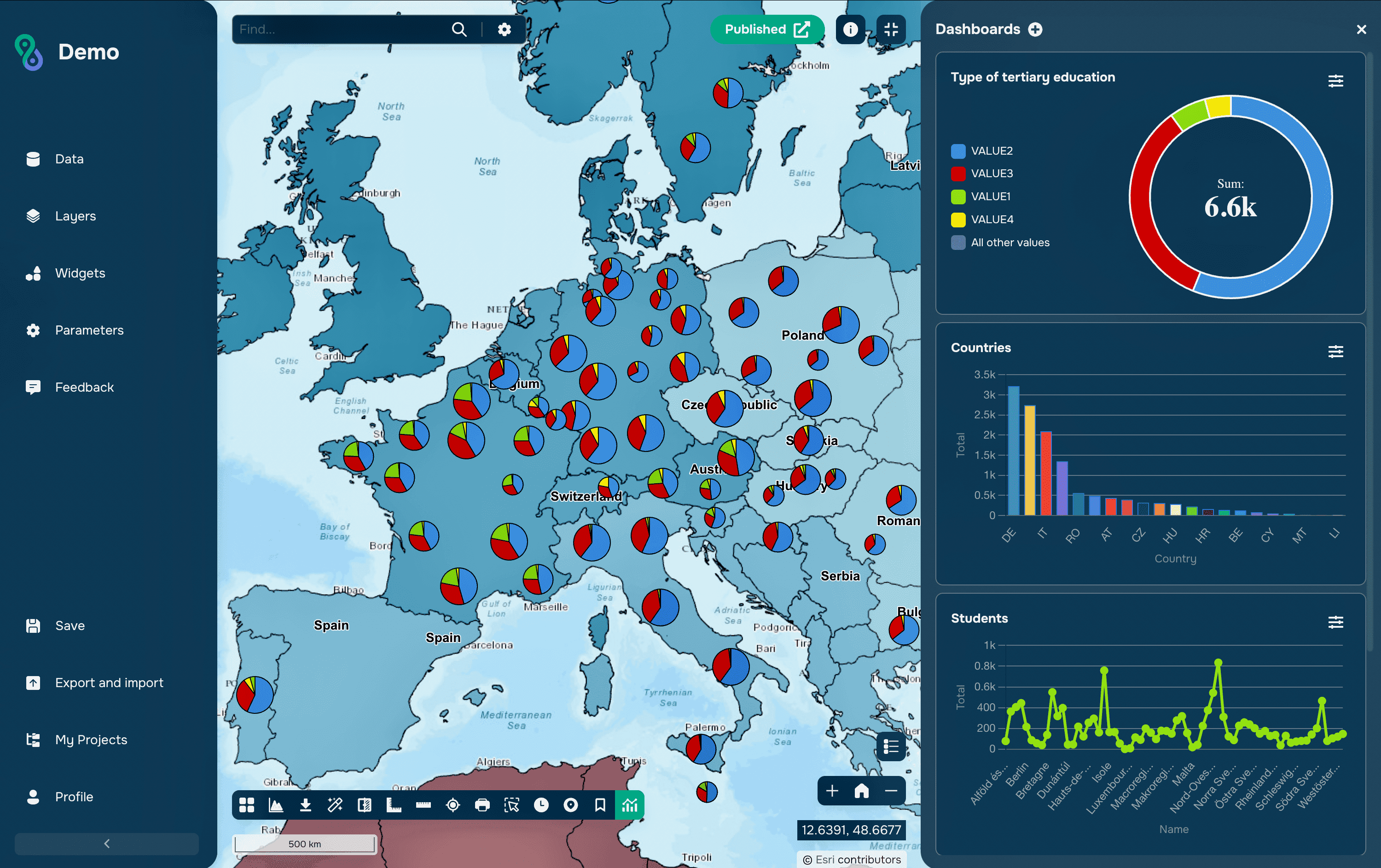
A choropleth map is one of the most common methods of visualizing spatial data. These maps are used to display statistical indicators for administrative units: regions, districts, municipalities, or countries. For example, choropleth maps can be used to show population density, unemployment rate, average income, disease incidence, or precipitation.
However, the appearance of a choropleth map depends on more than just the chosen color palette. Equally important is the data classification method—the way in which values are distributed across color intervals. The same data set can be presented in different ways, and each will highlight spatial patterns in its own way.
What is data classification?
Most statistical indicators represent continuous numerical values. For example, population density can vary from 5 to 15,000 people per square kilometer. Assigning a separate color to each value would make the map virtually unreadable.
To make a cartogram understandable, the range of values is divided into several classes (usually 4 to 7). Each class corresponds to a specific color shade.
The main goal of classification is to group data so that the map most accurately reflects real spatial differences.
It is important to understand that the same data set can appear completely different depending on the chosen classification method. This is why professional cartographers always select a method based on the nature of the data distribution and the objectives of the study.
Equal Interval
The equal interval method is considered the simplest. The entire range of values is divided into intervals of equal width.
For example, if the minimum value is 0 and the maximum is 100, then with five classes, the intervals would be as follows:
0–20
20–40
40–60
60–80
80–100
The advantage of this method is its simplicity. The user easily understands how the intervals are formed, and comparing values becomes intuitive.
However, this method only works well with a relatively even distribution of data. If most features are concentrated within a narrow range, a significant portion of the map may appear colored almost uniformly, and differences between areas will be poorly visible.
The equal interval method is often used to display climate parameters, elevation, temperature, or precipitation.
Quantile (Quantiles)
The quantile method is constructed on a different principle. Here, each class contains the same number of objects, regardless of the range of values. For example, if there are 100 districts and five classes are used, each class will contain 20 districts.
The main advantage of this method is the even distribution of objects between colors. This results in a balanced map and allows for easy comparisons between districts.
The disadvantage is that very similar values may end up in different classes, while significantly different values may end up in the same class. This sometimes leads to visual exaggeration of differences.
The method is especially useful when comparing socioeconomic indicators: income levels, population density, ratings, or development indices.
Natural Breaks (Jenks)
Natural Breaks, or the Jenks method, is one of the most popular classification methods in modern GIS. The algorithm automatically analyzes the data distribution and finds class boundaries that minimize differences within each class and maximize differences between classes. In other words, the method attempts to cluster similar values and separate groups with significant differences.
The advantage of Jenks is that the map reflects the natural structure of the data and is typically the most informative.
However, the intervals will vary for each new dataset, making maps constructed separately more difficult to compare.
Natural Breaks are often used to display property values, crime rates, demographic indicators, and other unevenly distributed statistics.
Standard Deviation
This method is based on the statistical concept of standard deviation. Instead of fixed intervals, classes are constructed relative to the mean. Some areas fall into groups with values above the mean, while others fall into groups with values below.
This approach allows for the quick identification of areas that deviate significantly from the overall picture.
For example, one can identify areas with abnormally high concentrations of air pollution, extremely high income levels, or unusually high population density.
A disadvantage of this method is that it is more difficult for untrained users to understand, as it requires an understanding of the mean and standard deviation.
Geometric Interval
The geometric interval method is designed for data with very wide value ranges.
It combines the benefits of uniform distribution and natural breaks, attempting to reduce the influence of extremely large or small values.
This approach is especially useful when working with economic indicators, population sizes of large cities, production volumes, and other data where values vary by tens or hundreds of times.
Although this method is used less frequently than others, in many cases it produces the most balanced cartogram.
Manual Classification
Sometimes automatic algorithms are not suitable for solving a problem. In this case, the cartographer manually defines interval boundaries. This approach is used when official standards or predefined value ranges exist.
For example:
risk level;
water quality categories;
environmental standards;
tax rates;
administrative classifications.
The main advantage of manual classification is complete control over the data display. However, in the absence of objective criteria, there is a risk of subjective interval selection, which can distort the map's perception.
How to choose the right method
There is no universal classification method. The choice depends on both the data structure and the purpose of the study.
If the natural distribution of statistical indicators needs to be shown, Natural Breaks (Jenks) is most often chosen.
Quantile is a good choice for comparing areas.
If it's important to maintain a consistent range of values for each class, use Equal Interval.
For detecting anomalies and deviations, Standard Deviation is the most informative method.
When working with data with a wide range of values, consider Geometric Interval, and if official thresholds are available, use Manual Classification.
Before choosing a method, it's useful to plot a histogram of the data distribution. This will help you understand how evenly the values are distributed and which classification method will best highlight spatial patterns.
How does this work in GISCARTA?
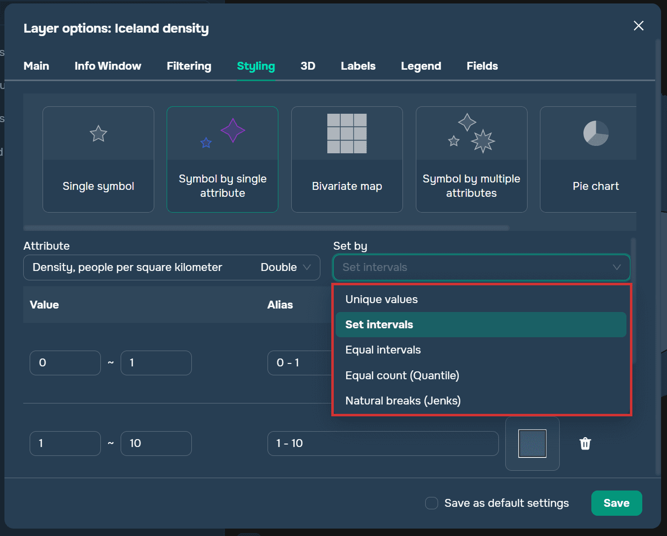
The following choropleth map classification types are available on the GISCARTA platform:
Equal intervals
Equal count (Quantile)
Natural breaks (Jenks)
Manually set
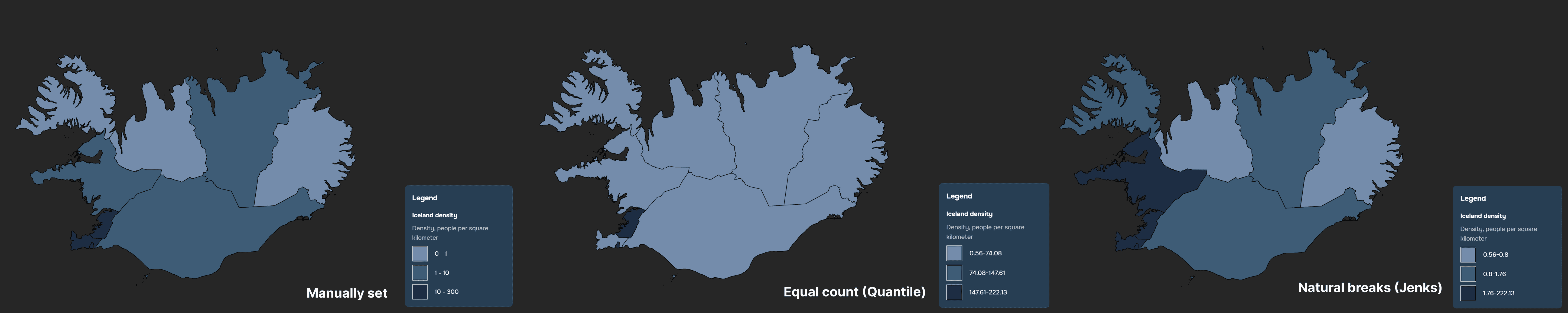
An example of a choropleth display with different classification methods.
FAQ
Which classification method should I choose?
It depends on your data and analysis goals. Jenks is a good general-purpose choice, while Quantile is ideal for comparing areas.
Why do the same data look different on different maps?
Different classification methods create different class boundaries, changing how spatial patterns are displayed.
Key Takeaways
Choose the classification method based on your data distribution.
Different methods can produce very different maps from the same dataset.
The right classification improves both map readability and analysis.